
Data Visualization in PowerBi
PowerBi is a great tool for developing visualizations from aggregated data.
Power Bi continues to evolve over time and as a Microsoft product, fits especially well in its ecosystem. It combines well with MS SQL server, MS PowerQuery, Power Automate, SharePoint, and many other tools.
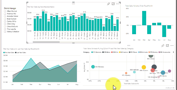
First things first, PowerBi works well with big excel data. However, where it truly shines is in its ability to aggregate and leverage very large data sets. As you'll see from the image on the right, Power Bi is dynamic. You can visualize data and present it graphically. The end user can simply click on data points within the graphs or charts to change what they see. Alternatively, slicers can be added to drill down through the data. Slicers allow the user to select date ranges, locations, product or person names, and more. The simplicity adds a whole new dimension for persons in decision making or leadership roles to better understand whats happening.
Lets go over the two main types of PowerBi. The trial version is free but limited in what you can do with it. For this instance, I'll cover the paid (monthly) version.
After installing PowerBi Desktop, most organizations will have SQL server database on-prem, in the cloud, or a hybrid setup.
If you don't know how to link to the server and entities, speak with your systems administrator for guidance. If you're a Microsoft shop, you may be using dataverse, sql database, or something else. Either-way, you'll need a password and other parameters to get the data. If you're working from home, don't forger VPN access.